


Custom Reports & Dashboards in GA4: Data Visualization Tips
Sep 05, 2023
13 min read

Data visualization in Google Analytics 4
Data visualization plays a crucial role in Google Analytics 4 (GA4) by transforming raw data into visual representations such as charts, graphs, and dashboards. It allows users to gain a deeper understanding of their website or app performance, user behavior, and key metrics. Here’s why data visualization is important in GA4 and its impact on decision-making:
- Simplifies Complex Data
GA4 collects a vast amount of data, and visualizing it helps simplify complex information. Visualizations provide a clear and concise overview of data, making it easier to identify patterns, trends, and outliers at a glance. - Enhances Data Interpretation
Visual representations make it easier for stakeholders, such as marketers and business owners, to interpret data and make informed decisions. Visualizations highlight key performance indicators (KPIs) and trends, facilitating quick and effective decision-making. - Supports Data Exploration
Data visualization in GA4 enables users to explore data interactively. Users can drill down into specific metrics, dimensions, or periods, gaining deeper insights into user behavior and website/app performance. This flexibility allows users to uncover actionable insights and answer specific business questions. - Facilitates Communication
Visual representations are highly effective in communicating data-driven insights to stakeholders. Reports and dashboards with visually appealing charts and graphs make it easier to share findings with team members, clients, or executives. It improves communication by presenting complex data in a visually engaging and digestible format.
Understanding Custom Reports in GA4
Custom reports in GA4 allow users to tailor data analysis to suit their specific business needs. Unlike the session-based model in Universal Analytics (UA), GA4’s event-based data model treats events as the core unit of measurement, providing more flexibility and granularity in tracking user interactions. This enables better tracking of user behavior across multiple devices and platforms.
To create a custom report in GA4, follow these steps:
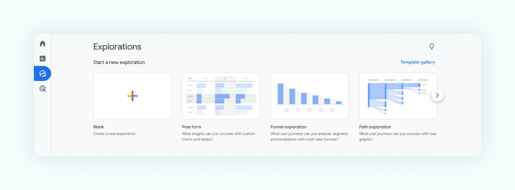
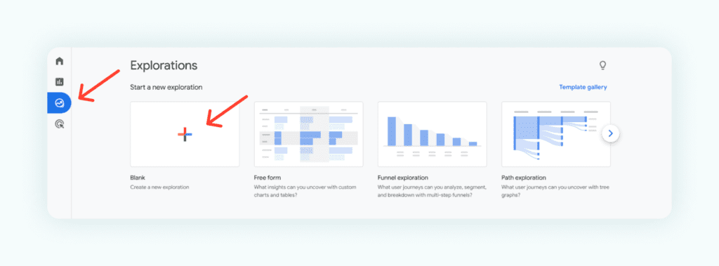
Step 1: Choose Free Form in the Explore Tab
To begin creating your custom report, head to the Explore tab in GA4 and select the “Free Form” option. This feature enables you to have complete control over the data you want to analyze and visualize.
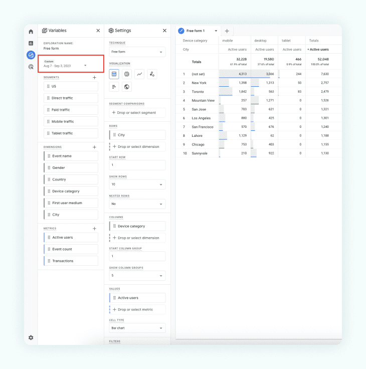
Step 2: Pick Date Range
Next, set the date range for your report to focus on specific periods. You can choose predefined date ranges like “Last 7 days” or “Last month,” or customize it with a specific start and end date.
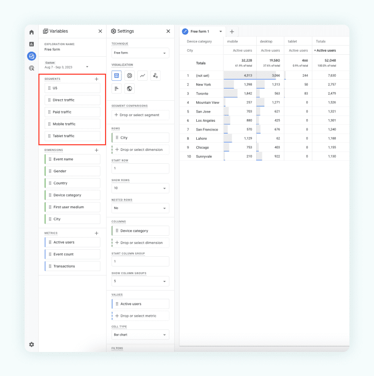
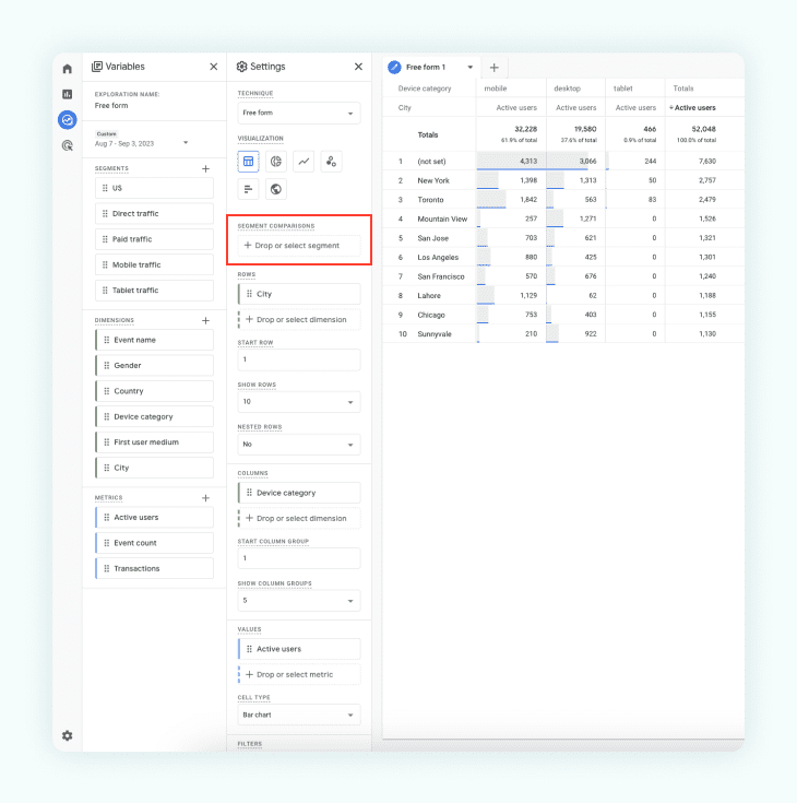
Step 3: Add Segments (Optional)
If you want to segment your data based on specific criteria, you can add segments to your report. Segments allow you to analyze subsets of your audience, such as new users or users from specific locations.
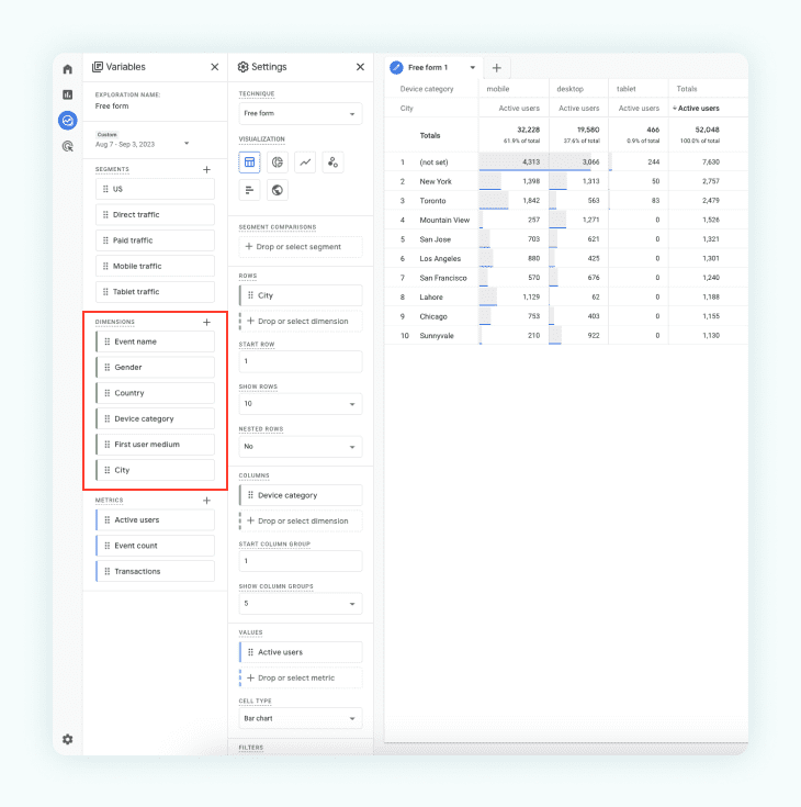
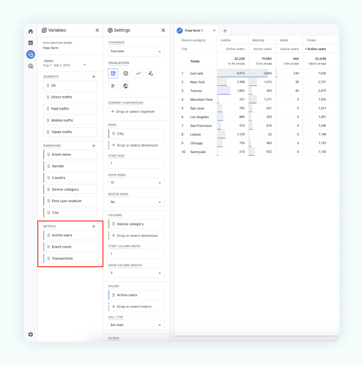
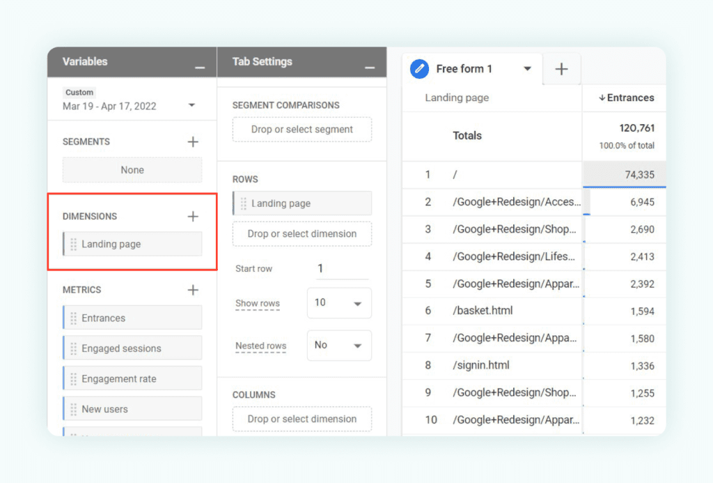
Step 4: Add Dimensions
Segments in GA4 serve the same purpose as they did in Universal Analytics. They allow you to categorize your traffic into different buckets, enabling you to analyze it independently or compare it with other segments. Examples of dimensions include “Source/Medium,” “Device Category,” and “Page Title.” Choose the dimensions that align with your analysis goals.
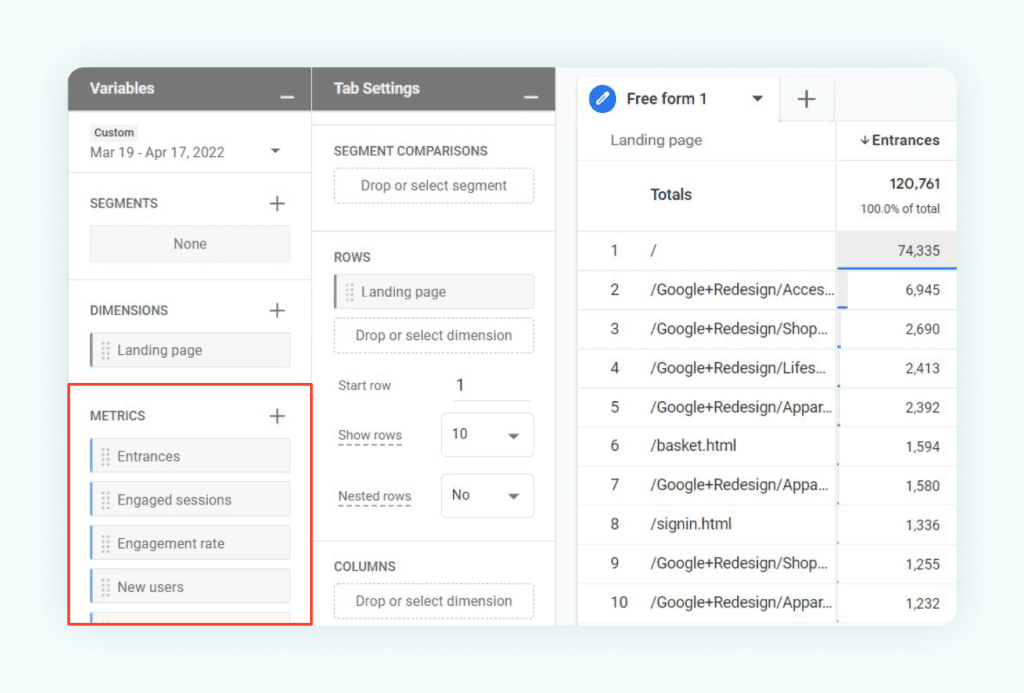
Step 5: Add Metrics
Metrics are quantitative data points that provide insights into user behavior. Common metrics include “Sessions,” “Pageviews,” and “Conversion Rate.” Select the metrics that will help you measure and evaluate performance.
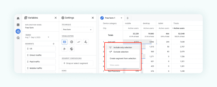
Step 6: Drag & Drop Segments
To further segment your data, you can drag and drop the segments onto your report canvas. This allows you to compare metrics between different segments and identify trends or differences.
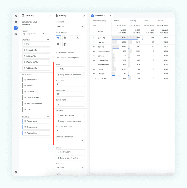
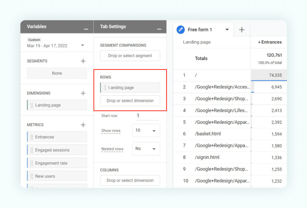
Step 7: Drag & Drop Rows and Columns
Customize your report layout in Google Analytics 4 by effortlessly dragging and dropping dimensions onto the rows and columns of the report canvas. This arrangement defines how data is displayed, enabling you to analyze and compare valuable insights from different perspectives. Gain a comprehensive understanding of your data and make informed decisions to enhance your digital strategy.
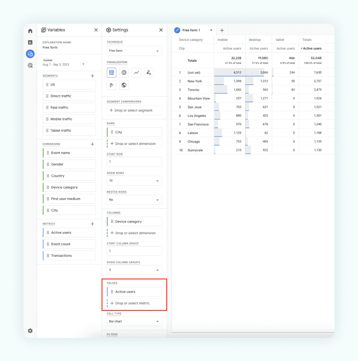
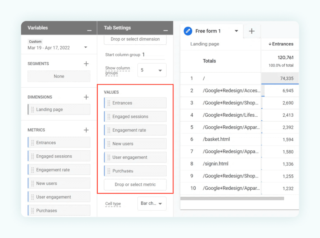
Step 8: Drag & Drop Values
Populate your report with quantitative data for visualization by simply dragging and dropping the desired metrics onto the “Values” section of the canvas in Google Analytics 4. This step enables you to visualize crucial data points, facilitating a clear and concise representation of your website or app’s performance. Harness the power of data visualization to gain actionable insights and optimize your digital presence effectively.
Step 9: Drag & Drop Filters
Refine your report with precision by utilizing filters in Google Analytics 4. Drag and drop dimensions into the “Filters” section of the canvas to narrow down data based on specific criteria. This enables you to gain deeper and more insightful analytics, empowering you to make data-driven decisions that align with your business objectives.
Custom reports can be highly valuable for different business objectives. Whether you’re analyzing eCommerce performance, lead generation efforts, or content engagement, custom reports offer valuable insights tailored to your unique goals.
Custom Explore Report Example: Landing Pages
Step 1: Create a Free Form Report
To start, navigate to Google Analytics 4 and access the “Explore” tab. Choose “Free Form” to build a flexible report tailored to your specific analysis needs.
Step 2: Add Dimensions
Enhance your report’s depth by adding relevant dimensions that categorize your data. Examples include “Source/Medium,” “Device Category,” or “Location.”
Step 3: Add Metrics:
Select essential metrics like “Sessions,” “Pageviews,” or “Conversion Rate” to measure and evaluate user behavior and performance.
Step 4: Click and Drag Dimensions & Metrics
Customize your report effortlessly by clicking and dragging dimensions and metrics to rows, columns, or values.
This simple arrangement allows you to visualize and interpret your data effectively, providing valuable insights for data-driven decision-making. Experiment with different combinations to unlock the full potential of your Google Analytics 4 Custom Reports.
Tips for Data Visualization in Custom Reports and Dashboards
Choosing the Right Visualizations
When creating custom reports and dashboards in GA4, you have access to various types of visualizations such as line charts, bar charts, and pie charts. These visualizations allow you to present data in a visually appealing and easy-to-understand manner.
Selecting appropriate visualizations is crucial for effectively conveying insights. Consider the type of data you have and the message you aim to convey. Line charts are useful for showing trends over time, bar charts are suitable for comparing data, and pie charts can represent proportions or percentages. Matching the visualization type to the data ensures clarity and enhances the audience’s understanding.
For different scenarios, consider the following examples and recommendations:
- Trend Analysis
Use line charts to showcase trends, allowing users to easily identify patterns and changes over time. - Comparison
Bar charts are effective for comparing data between different categories or groups, enabling quick visual comparisons. - Distribution:
Pie charts can illustrate the distribution of data into segments or categories, making it easy to understand the proportional breakdown
Enhancing Visual Appeal
Visual appeal plays a crucial role in engaging users and improving data comprehension. A visually appealing report or dashboard can capture attention, facilitate understanding, and make data exploration more enjoyable.
To create visually appealing reports and dashboards in GA4, consider the following tips:
- Color Schemes
Use harmonious color schemes that complement each other and align with your brand or website. Consistency in color choices enhances the overall visual appeal. - Font Styles:
Select legible font styles and sizes that ensure readability. Pay attention to headings, labels, and annotations to guide users through the data. - Consistent Branding:
Incorporate your brand elements, such as logos or color palettes, to maintain consistency with your website or brand identity.
GA4 offers customization options to make reports and dashboards visually consistent with your brand or website. Leverage these options to customize backgrounds, fonts, and color palettes, aligning the visual elements with your desired aesthetic.
Data Filtering and Segmentation
Data filtering and segmentation are essential for focused analysis in custom reports and dashboards. By applying filters and segments, you can refine the data displayed and create more meaningful insights.
In GA4, you can utilize filters and segments to focus on specific subsets of data. For example, you can analyze traffic from specific channels or track the performance of individual marketing campaigns by applying appropriate filters and segments.
Some specific use cases for data filtering and segmentation include:
- Channel Analysis
Filter data to analyze the performance of different marketing channels such as organic search, social media, or paid advertising. - Campaign Performance
Segment data to evaluate the effectiveness of specific marketing campaigns and understand their impact on key metrics.
Advanced Techniques for Custom Reports and Dashboards in GA4
Take your custom reports and dashboards in GA4 to the next level with advanced techniques that offer more sophisticated insights and capabilities.
Consider incorporating calculated metrics and dimensions to derive additional insights. These calculated values can be based on existing metrics and dimensions, allowing you to create custom metrics that align with your specific business needs.
Explore the integration of data from external sources to enrich your reports and dashboards. GA4 allows you to blend data from different sources, enabling a comprehensive view and facilitating cross-analysis.
Sharing your custom reports and dashboards with others is essential for collaboration and stakeholder engagement. In GA4, you can easily share reports and dashboards with team members and stakeholders, providing them with access to the insights and information they need to make informed decisions.
Conclusion
Creating custom reports and dashboards in Google Analytics 4 empowers businesses to visualize data effectively and gain actionable insights. The art of data visualization lies in turning raw data into visually appealing and informative representations. By following the tips and best practices outlined in this article, marketers can create custom reports and dashboards that support data-driven decision-making and drive business success. Embrace the power of data visualization in GA4 to unlock the full potential of your analytics and gain a competitive advantage in the dynamic digital landscape.