BRM Sales Online Store

How we created a convenient product navigation system for an online bearing store and simplified the ordering process.

BRM Sales Online Store

How we created a convenient product navigation system for an online bearing store and simplified the ordering process.

Client

BRM Sales is a leader in the bearings industry offering a complete line of precision radial ball bearings and bearing related products for nearly 50 years.
BRM supplies a wide range of industries including medical equipment, robotics, high tech, LiDar, food processing, agriculture, and renewable energy.

Сhallenge

The client wanted to develop a platform that would allow manufacturers and individual customers to purchase goods in the BRM sales store, and managers to handle orders, customers and inventory.
They asked us to build an information architecture so that it looks clean and intuitive for inexperienced users.

Solution

Our team followed the best practices of human-centered design as it helps users intuitively understand complex data. 
We introduced modern payment methods and integrated the online store with the ERP and the supplier’s website. This improved inventory management and increased the size of inventory items. Our team enhanced the shopping experience of BRM customers.

Discovery phase

During the discovery phase, we conducted research on competitors and the target audience, which helped us to set the priorities. Our team had numerous interviews with the client.

Competitor analysis

We analyzed the navigation of the main competitors, identified weaknesses, strengths and their opportunities. This fundamental data helped to create information architecture and better understand the market. 

Personas analysis

The study of user personalities allowed us to understand the needs of the target audience, their goals, fears and pains. This information helped us in creating additional features that covered all the needs of the user.

Information Architecture

Based on research and analysis, we structured store’s navigation information in accordance with the user’s needs.

High-Fidelity Wireframes

The development of the site structure in the form of a prototype helped the client to better understand the idea of the project structure. This made it easier to perceive the future structure of the site and coordinate blocks and content with the client.

Capturing and Improving Key Pages

First of all, we worked out the key pages of the site: the Home page, the category page and the product page.
pib cases

Home page

We have made the home page bright as it is the first page a visitor lands after the search engine. The bright colour serves to attract the potential customers.
The significant role of the main page is to facilitate navigation to other pages on the site, so our design team used their best practices to make it intuituive for the users.

Category page

Based on the analysis of products, we structured the filtering for quick search, and made it possible to display both table and grid views.
We have implemented a short description of the category and a detailed one at the beginning of the page.

Product page

From the product page, the user has the opportunity to add the required quantity to the cart and also request a price for a large number of products. We made it possible for the user to compare the products. If he has questions about the product, he can contact the sales manager.
The substitute products block is located on the page so that the user has the opportunity to choose a suitable product.

Client Panel Screens

We have developed an intuitive and simple dashboard interface. All its pages have a single structure, which allows users to learn how to use the system faster and have a smooth and consistent experience.

Introduction of new features

We have carefully approached the user’s pain and created new features that solve all the problems and simplify and speed up their work.

Back orders

The user can add a product that is not in stock to the deferred products. He can also track the status of the product’s readiness for the order and receive notifications. This functionality has an advantage because we do not say that the product is out of stock and it cannot be ordered. Instead, we suggest adding it to the Back orders list. 

Quote history

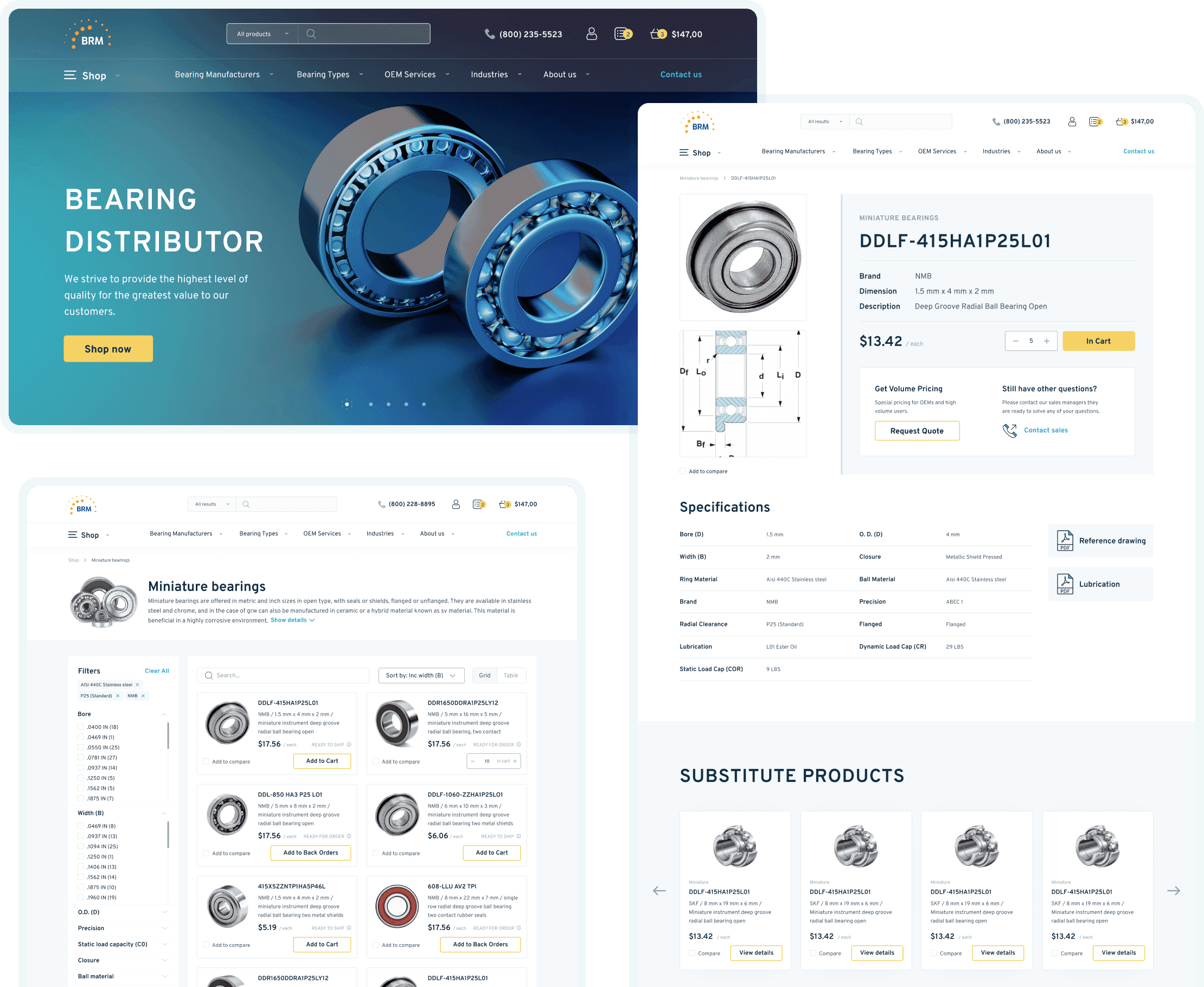
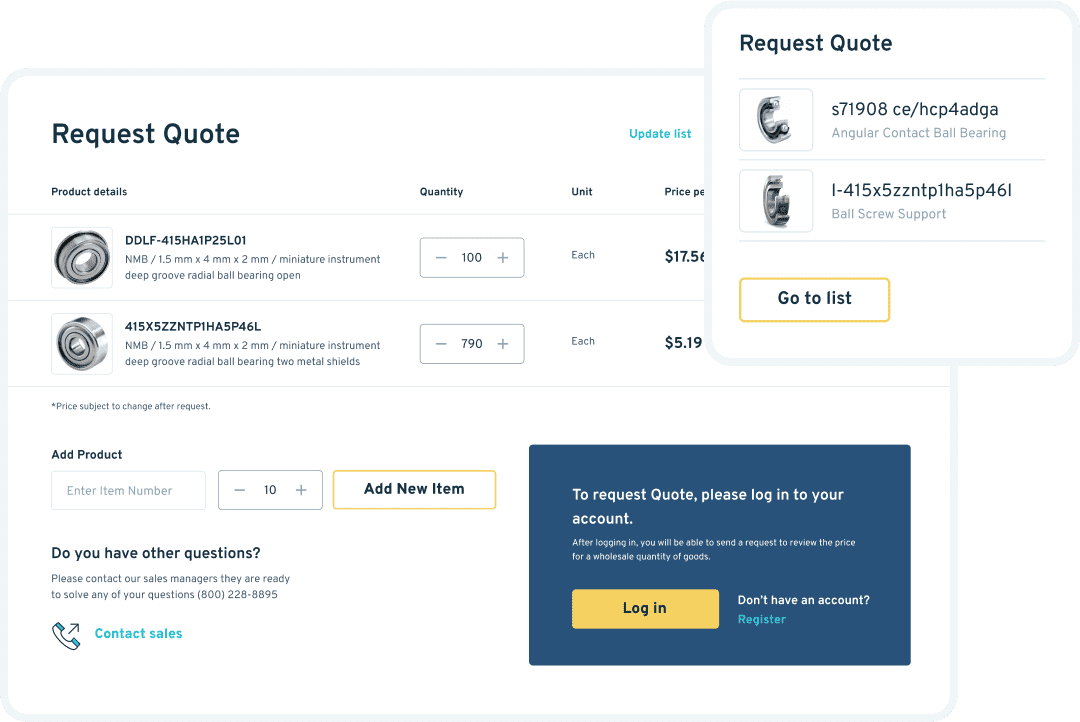
Since our target audience is equipment manufacturers and in most cases they order a large volume, we have worked out the functionality for requesting prices directly on the website. On each product page, the user can make a price request for a specific product and a specific quantity.

The request can be made even if the product is currently out of stock. After the request, the user will also be able to track the status of the request in his personal account.

Global search

Since there is quite a lot of information on the site and there can be quite a large output during a brainstorm during a search query, we came to the decision to reduce the cognitive load on the user by implementing a global search.

Search results are grouped by pages, products and categories.

Compare products

For a more accurate selection of the bearing, we have implemented a comparison function. The user can add products for comparison from the catalog and product pages and immediately see them in the bottom pinned panel.

By going to the comparison page, the user has the opportunity to hide the same parameters and also immediately add the product that he has chosen to the cart.

Customer item

During the analysis of the target audience, we have found out that many companies have their own internal inventory system.

For convenience, we have introduced the ability to enter your own inventory number of the product and send it to the BRM sales department. This function helps to “communicate in one language” with one product. The ERP has a content field for placing this data. The user can assign the customer’s product number from the product page and edit it if something has changed.

Development of the system design

We have created atomic design systems, which means separating interfaces into fundamental blocks and combining them, gradually increasing the complexity. The design system helps the client to scale the site with ease, and it also makes it easier for the site users to perceive the content because he can easily trace the hierarchy system.
development design system

Feedback and communication

We have built close and transparent communication with our clients in order to better understand the details of the project and speed up the whole process.

Weekly status & regular calls

A kick-off call opened our cooperation with a client, where we met and discussed our primary tasks. The process was divided into sprints, where one sprint equals two weeks. Every week our team demonstrated the job done. We also had calls with the client once or twice a week. Such calls helped us get feedback from stakeholders about whether we are moving in the right direction or not.

Working process

Our team has gone through 9 stages from the discussion to the release of the project.

Results

It was really important for our client that we understand the project’s specifics and and fully implement his ideas and needs into life. Through close cooperation and well-coordinated work, we met all the client’s expectations in terms of the interface and the logic of the online store.
Deliverables
  • Creation of an online store
  • Integration of the online store with the preferred ERP and a supplier’s site
  • Useful features for quick use among big amount of products
  • Customized product names for each organization
  • Convenient payment system
  • Back orders functionality for out-of-stock items
  • Ability to request a quote for a special price
Project in figures (impact created)
19
People
7000
Hours
95 +
Design layouts
Tools Used
Figma, Miro, WordPress, Laravel, PHP, MySQL, JS/jQuery, Bootstrap, CSS, HTML, Rest API, Webpack, SASS, NGINX

Let us do the work for you!

Start your new project with a fresh approach


    By entering your email, you agree with our Terms of use and Privacy policy